The Technical Stuff That Actually Matters
Flexible Grid Systems
Responsive design uses flexible grids that adapt to any screen size. Think of it like water filling different containers – the content flows and reshapes based on the space available.
Instead of fixed widths (like 960px), everything uses percentages. A three-column layout on desktop becomes a single column on mobile automatically.
Images That Scale Properly
![Responsive Image Examples] Before: Huge desktop image cropped awkwardly on mobile After: Properly scaled and positioned for mobile viewing
Nothing breaks a mobile experience like images that don’t fit. Responsive images automatically resize and sometimes even serve different images to mobile users for faster loading.
Touch-Friendly Interactive Elements
Buttons, links, and form fields need to be sized for fingers, not mouse pointers. I use the “fat finger rule” – if someone with large fingers can’t tap it easily, it’s too small.
Real Examples From My Recent Projects
E-commerce Site Transformation
Before: Desktop-only design
- Mobile conversion rate: 0.8%
- Average session duration: 45 seconds
- Bounce rate: 82%
![E-commerce Mobile Before/After Screenshots] Before: Product images tiny, buttons impossible to tap After: Large product images, easy-to-use cart and checkout
After: Fully responsive design
- Mobile conversion rate: 3.1%
- Average session duration: 2 minutes 15 seconds
- Bounce rate: 47%
Restaurant Website Redesign
The owner was losing online orders because people couldn’t read the menu on their phones. The old site showed a PDF menu that was impossible to navigate on mobile.
![Restaurant Menu Mobile Screenshots] Before: PDF menu requiring constant zooming After: Mobile-friendly menu with large, readable text
New mobile-friendly menu design resulted in:
- 156% increase in online orders
- 43% reduction in phone calls asking “what’s on the menu?”
- 67% improvement in mobile user engagement
The SEO Impact Nobody Talks About
Google doesn’t just prefer mobile-friendly sites – it punishes sites that aren’t mobile-responsive. Since 2018, Google uses mobile-first indexing, meaning it looks at your mobile site first when deciding how to rank you.
I’ve seen non-responsive sites drop 3-4 positions in search results literally overnight after Google algorithm updates. One client lost 40% of their organic traffic because their site wasn’t mobile-friendly.
Common Mobile Design Mistakes I See Everywhere
Mistake #1: Tiny Tap Targets
Buttons and links that are impossible to tap accurately. I see this on 60% of the sites I audit.
Mistake #2: Horizontal Scrolling
If users have to scroll sideways, you’ve failed. Period.
Mistake #3: Pop-ups That Can’t Be Closed
Mobile pop-ups that cover the entire screen with no visible close button. Google actually penalizes sites for this now.
Mistake #4: Slow Loading Times
Non-responsive sites often load massive desktop images on mobile, killing load times.
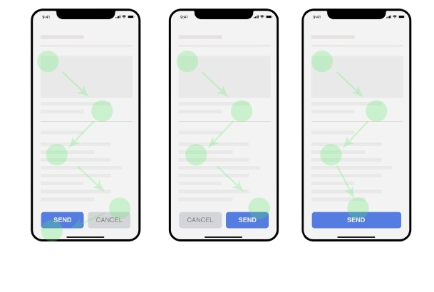
The Testing Process That Actually Works
I don’t just design responsive sites – I test them obsessively:
- Real device testing: I check sites on actual phones and tablets, not just browser simulators
- Network throttling: Testing on slow 3G connections to simulate real-world conditions
- Touch testing: Making sure everything can be tapped accurately with fingers
- Load time monitoring: Ensuring fast loading on mobile networks
![Mobile Testing Screenshots] Examples of testing responsive design across different devices
What This Means for Your Business
Every day your site isn’t mobile-friendly, you’re hemorrhaging potential customers. It’s not about keeping up with trends – it’s about basic usability.
I’ve helped businesses double their mobile conversions just by making their sites actually work on phones. The ROI is immediate and massive.
The Mobile-First Reality Check
Here’s the thing: mobile isn’t the future anymore. It’s the present. It has been for years.
If your website doesn’t work perfectly on mobile, you’re not competing in today’s market. You’re competing in 2010’s market while everyone else moved on.
Your customers are on their phones right now, searching for businesses like yours. The question is: when they find your site, will they be able to use it?